Twin TiersComic-Con
2014 - Present
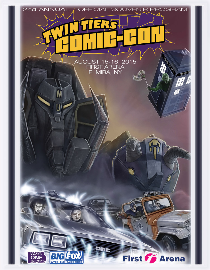
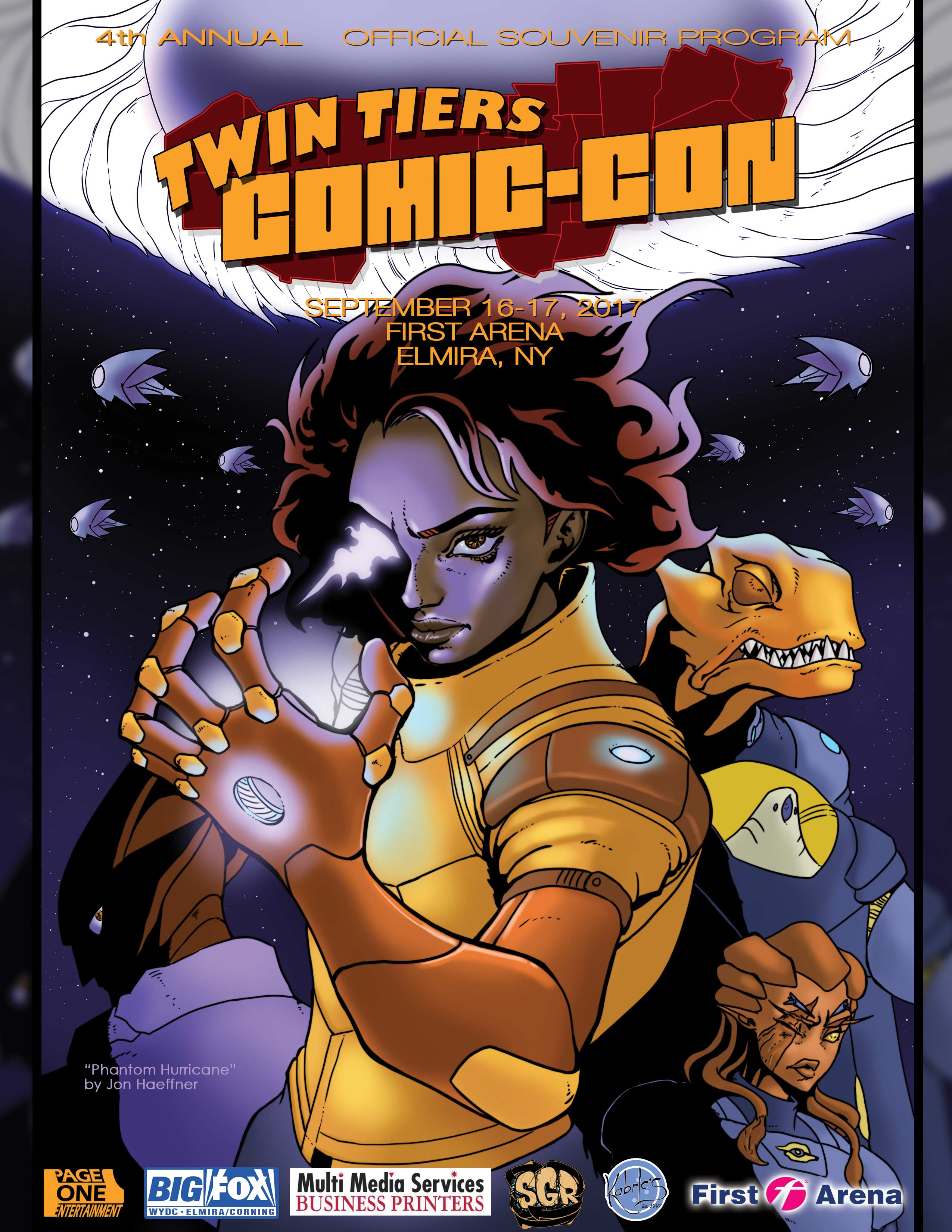
I have been the creative director and designer for Twin Tiers Comic-Con (T2C2) since its inception. Please enjoy the selections below.
Brand Development
In 2013, my partner and I split off from a previous venture, and it was necessary to re-brand our events with a name that we created and owned. We selected the name Twin Tiers Comic-Con, and I have designed and adjusted our logo every year
that we have hosted an event. The original focus was a comic-inspired logo design that was fun and colorful, resting atop a mapped outline of the various counties
commonly associated with the Twin Tiers.
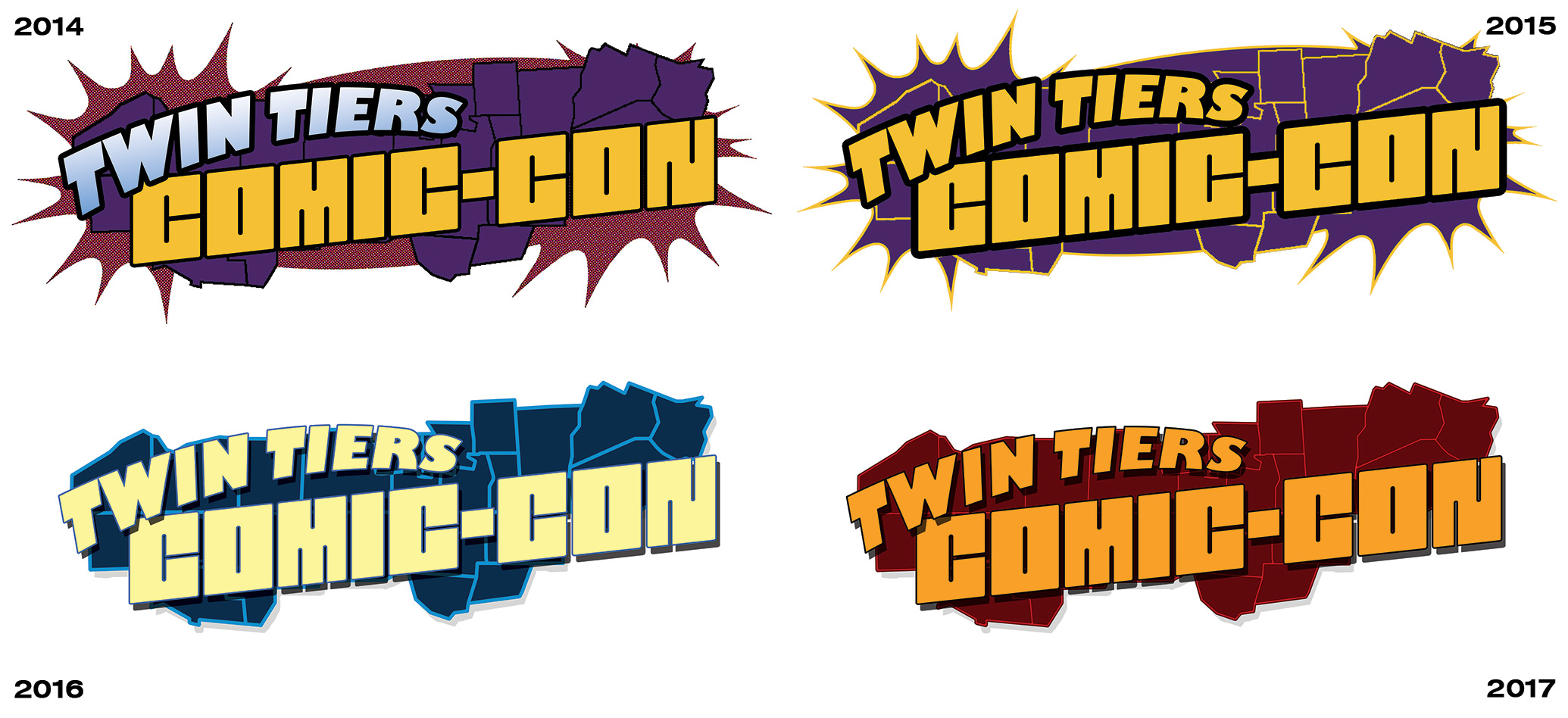 As the years went on, I scaled back the more campy comic book elements. I also began to change the color palettes with each year so that our marketing will appear recognizable yet fresh. What remains is a bolder and more simplified brand logo that I am proud of.
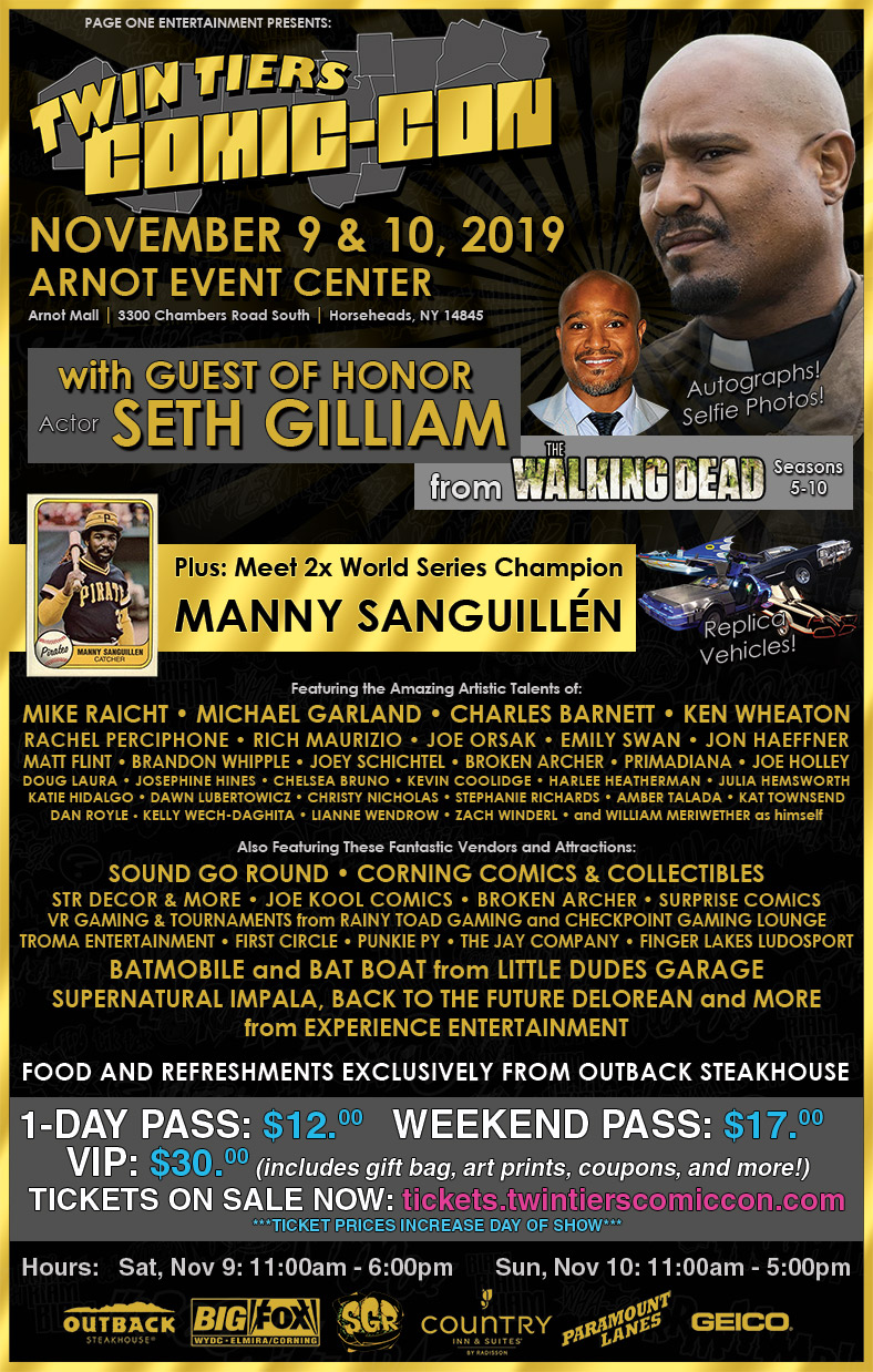
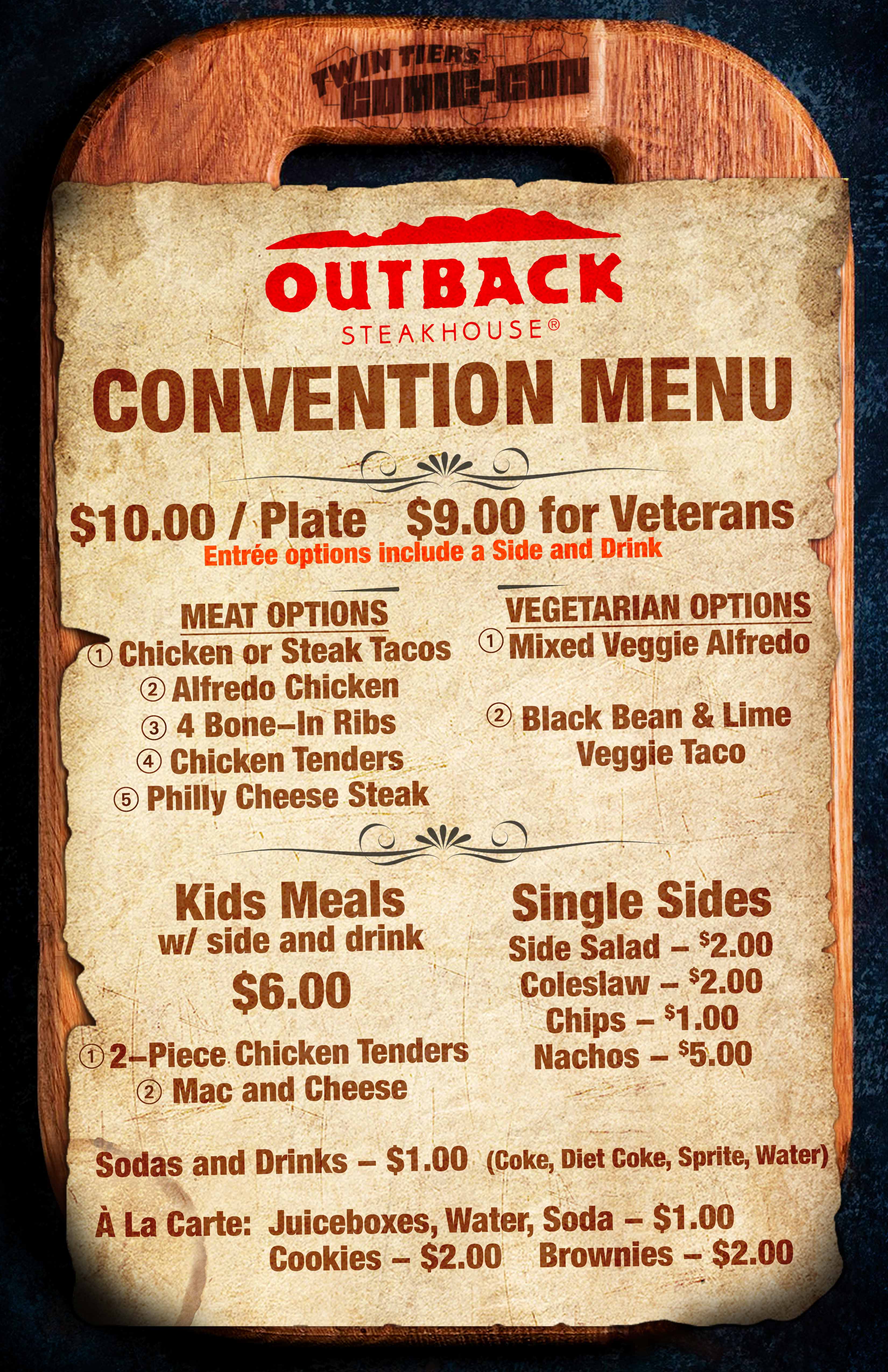
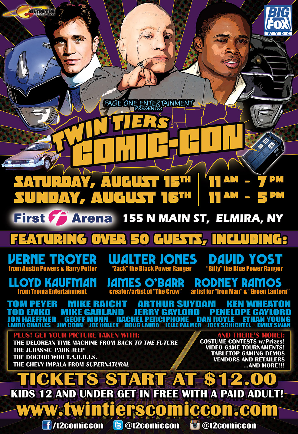
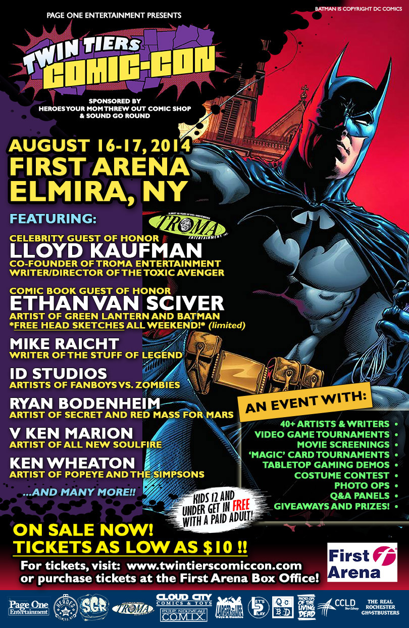
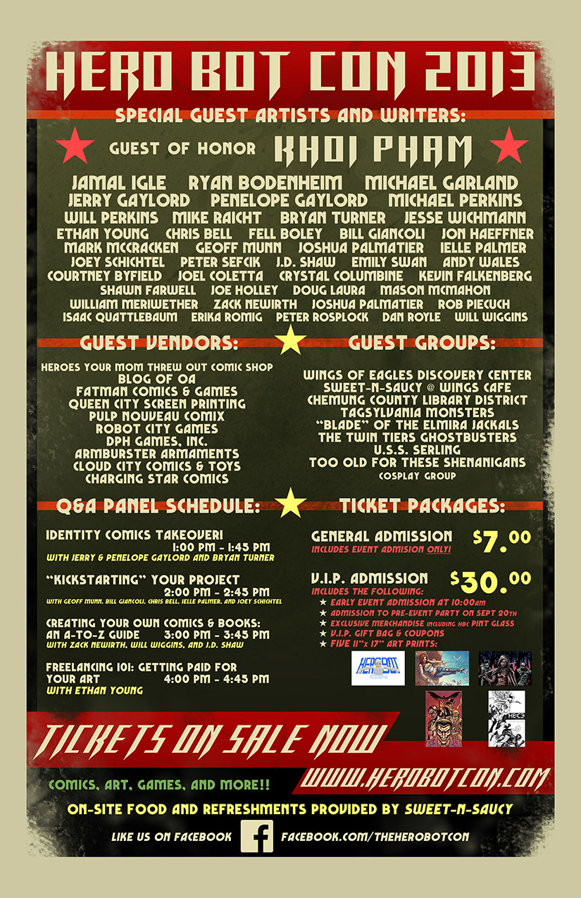
Posters and Signage
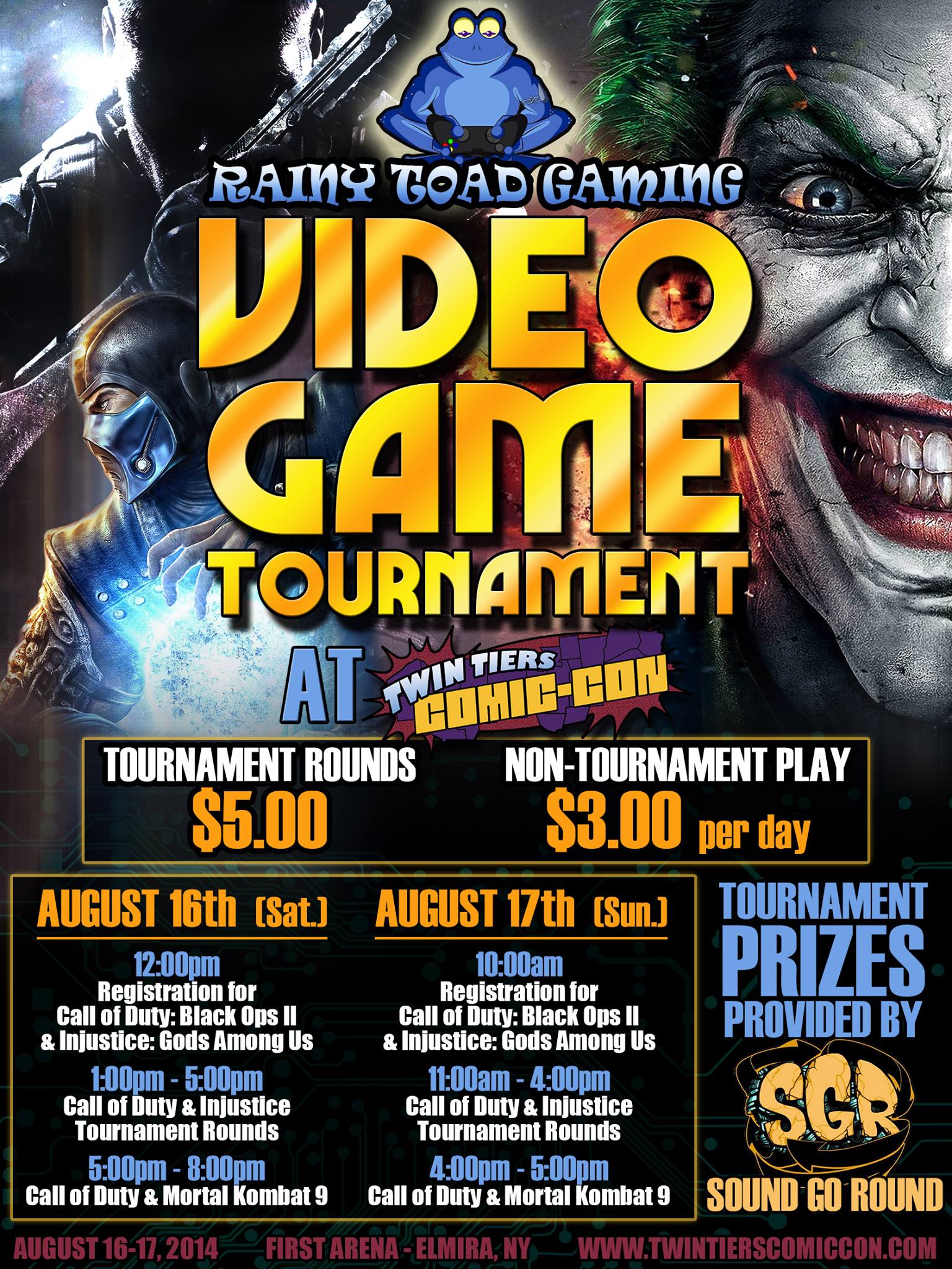
For most of the years we hold an event, I design and create a number of posters and signage for both digital and print usage. Posters and signage are created primarily through Photoshop and Illustrator.
Souvenir Program Booklets
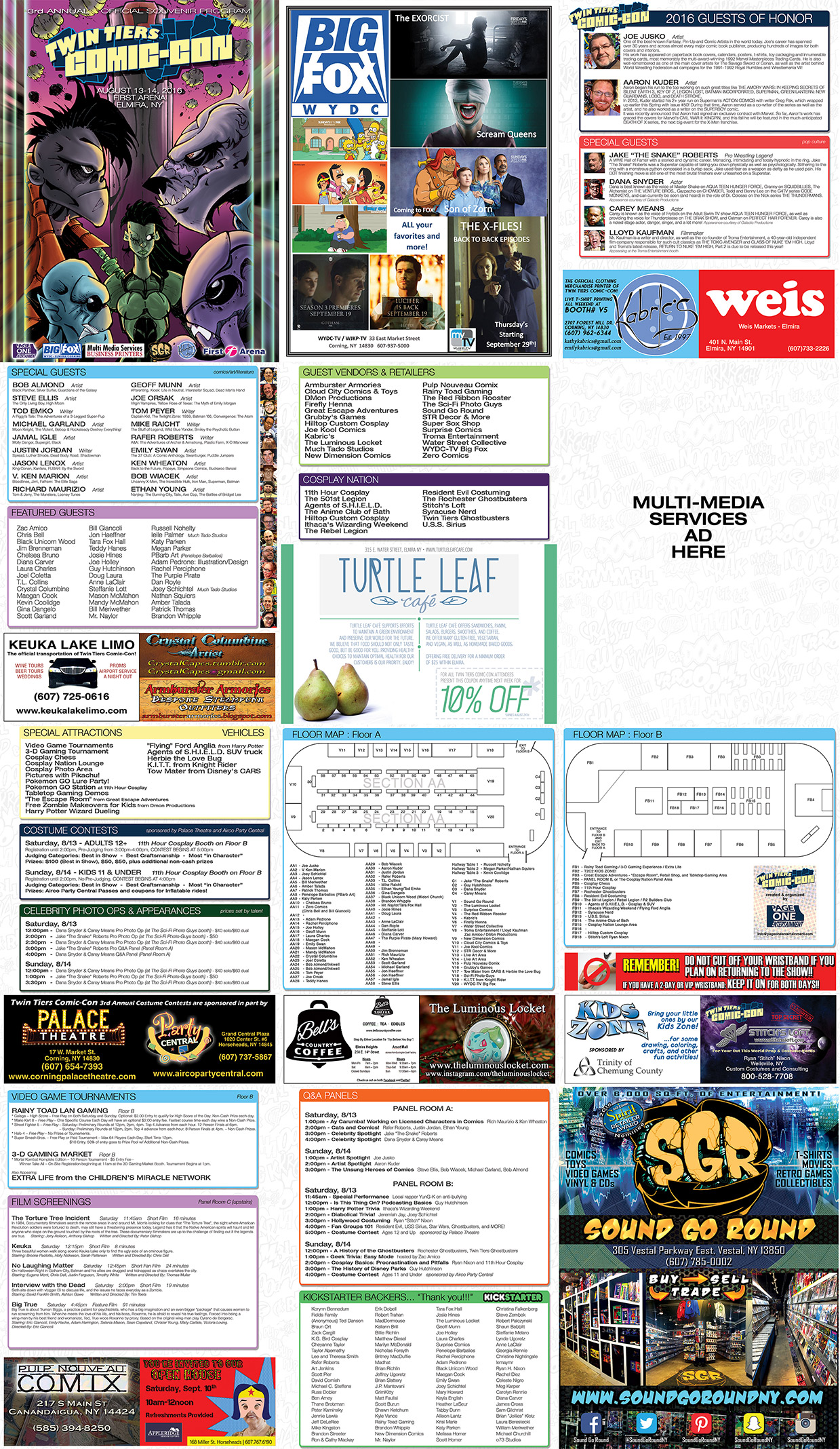
Many of our events included a program booklet highlighting the various guests, advertisers, and event schedules during a given show. Pages ranged from four to twelve depending on event breadth and ad space needed. All the program designs, layouts, floor maps, and advertisements were completed by me. All image editing was performed in Photoshop, and all layouts and compilations were executed in Illustrator or InDesign to be prepped for the printer.
